
For those who participated in my online Oscar pool, everyone who submitted with a working email address has been sent a results message. Didn’t get your message? Something was wrong with your contact info. Send me a new message and we’ll get it sorted out.
Now then, some of you may have noticed we’ve got a new logo for Click Your Poison books! It’s already live on the homepage, and being updated on my Amazon sales pages. So if you’ve already got a paperback edition of either title, congrats! It’s now a collector’s edition.
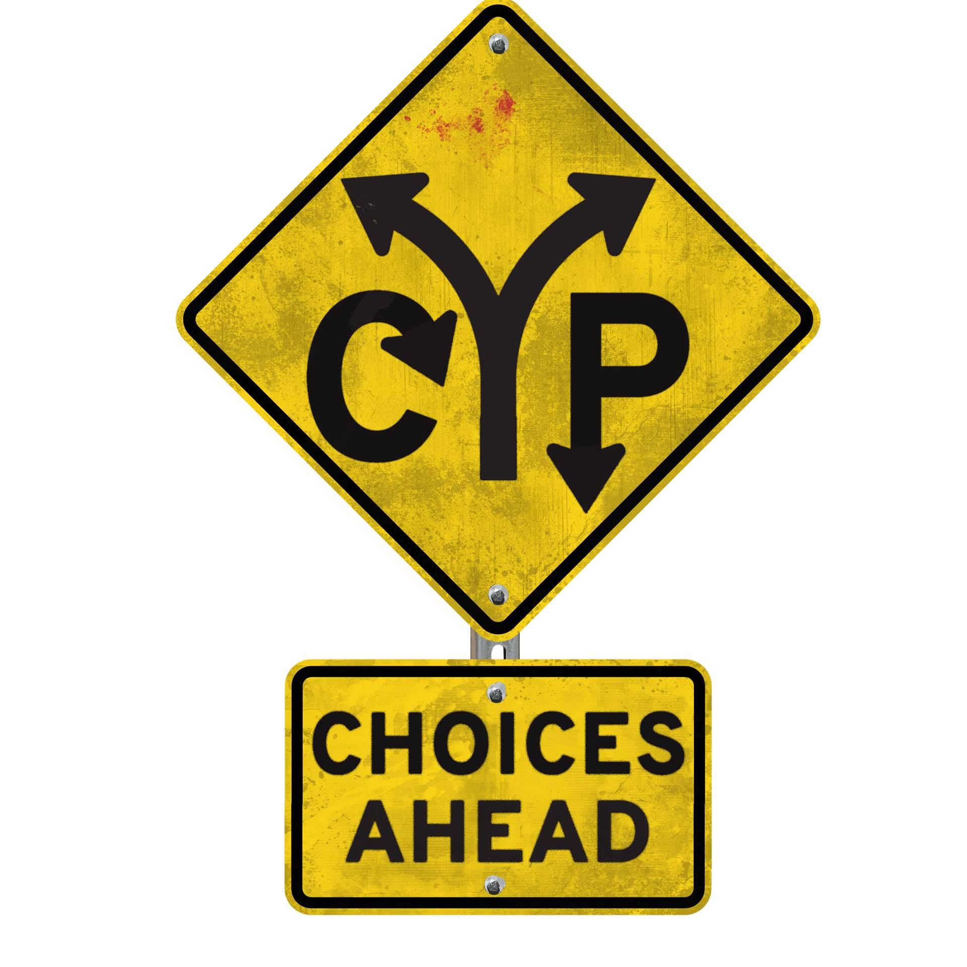
A logo for the series is something I’ve been considering for a while now, as a way to show that these are interactive, branching path novels. What do you think? Did I succeed? Think the new CYP traffic sign will direct readers towards the books?
Add your opinion in the comments below. And don’t forget to like, share, and subscribe!

Hmm. I get where you’re going but I kind of want something more sinister and poison like.
I hear you (even though there’s blood on the sign!), still, the point of the logo was to illustrate that the series is interactive. I’ll leave the individual book covers to convey the tone of each title. Thanks for commenting!
I love it! I’m very glad that your symbol for all the books is “clean.” Some books are appropriate for most ages, some are not. The symbol is great for all ages. It’s very simple and to the point. Perfect!
Thanks!