No, not “Cover Charges” — none of those are required to read this blog post. Do people still read blogs in 2020? I know it’s been a looooooong time since I’ve blogged regularly (sorry about that), but now that we’re under quarantine seems like a good time to start back up again.
I hope you’re all well and staying safe. I’m having a fun time juggling a one-year-old, passing her back and forth to my wife (who is also now working from home). Other than that, social distancing comes easy to a writer.
Onto the post!
Three new covers, coming right up.
#1 — PATHOGENS
The more astute of you may have noticed that PATHOGENS has a new cover.
The Old

The New

The Why
First, let me say that there’s a lot I like about the original cover. The detail work is stunning. That rat is amazing. The layers in the image are rich and deep. I also enjoy the throwback to Salvador Dali.

But, ultimately, I needed to change the cover for two reasons. First, I felt like the cover wasn’t closely related to INFECTED enough — and since these are “equels” (not sequels or prequels, but occur simultaneously), I wanted them better linked.

")

See how they’re a better fit now? And of course the original Dali photo for reference.
Additionally, PATHOGENS sales were the worst of the (at the time) four books. Since I’ve updated the cover, sales have gone up. What do you think? Which do you prefer?
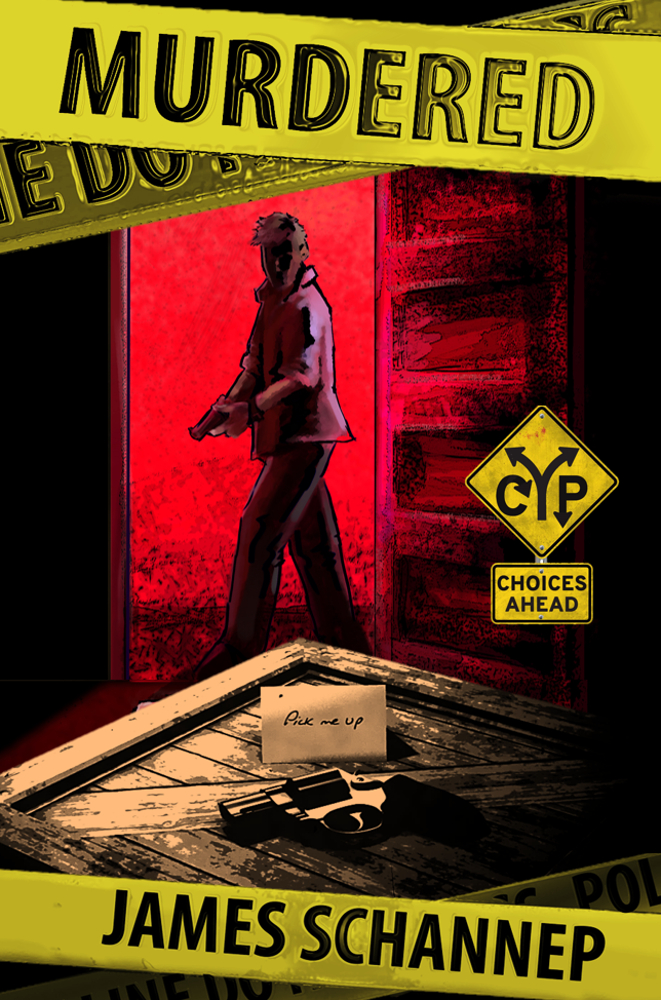
#2 — MURDERED
Right now, I’m in the process of updating the cover for MURDERED.
The Old

The New

The Why
The impetus for this change was not in my control, actually. I started running Amazon Ads this year, and MURDERED was flagged for “excessive gore.” After a few back and forths with the customer service team, they clarified that the blood and (possible) corpse in the foreground was the issue — either change the cover, or lose advertising rights.
I decided to use this as an opportunity to “fix” a few issues I had with the cover. Or, I suppose, to apply lessons I’d learned over the years. First, was to get rid of the body. Okay, done. Now we have the gun atop the crate with the “pick me up” note featured at the start of the story.
Second, was to increase the size of the title. I asked the original artist to repeat the title on the police ticker tape, but in hindsight I shouldn’t have done. Additionally, the police tape was too muted — and after I added the CYP logo, didn’t fit the color scheme.
I added further police tape for my author name, adjusted the size and location of the images, and cropped out a “CYP” lamp, which was redundant given the logo.
What do you think? Which do you like better?
#3 — SPIED
A new cover for a new book.

What do you think? The cover for SPIED (still a work in progress, sorry), was “leaked” in late 2019 (by me, on Facebook& Instagram).
I’m a bit behind schedule on my Click Your Poison releases, but I’ll chalk that up to:
- I’ve moved from the UK back to the US.
- I’m now a father. Babies take time; writing requires sleep.
- I wrote side-project. A linnear, coming-of-age novel.
I’m very proud of #3 (and #2, obviously. #1 I’m actually pretty sad about), and I’m trying to take this novel to a traditional publisher to find a bigger audience. But of course, this takes time. So, please bear with me, stay patient, and more interactive goodies will come your way soon. I’m still working on SPIED — and others!
What do YOU think? Leave a comment below to join in the conversation.
Thanks for reading, and don’t forget to share and subscribe!


